
Measuring Retention and Making Your CLV Model Reliable
Using retention data to improve the accuracy of your CLV model

Hello friends,
Welcome back to our ongoing series on customer lifetime value ("CLV"). Here is part 1, part 2, and part 3 — certainly not prerequisites, but they may help illuminate the post below (and future posts).
We're picking up where we left off in our previous post by exploring the topics below:
Subscriber decay curve — the best way to measure and visualize how well you're retaining your paid subscribers; it's also the most influential driver in our CLV model.
Customer lifetime — a numerical summary of the subscriber decay curve.
From our last post, we know how to approach these topics when we have yet to launch and don't have any data. After our product has been out in the wild for a handful of months or so, we can use retention data to update our decay curve assumptions in our CLV model. The more data we can use to form our decay curve assumption, the more confident we can be in our CLV projection.
Most importantly, we can start tracking how well we retain our subscribers. If we see improvement in our retention rates and decay curve, it can signal that we're improving our product and finding our audience.
Let's explore how we can use retention data to update our decay curve and make our CLV model more reliable and actionable.
But first, what is retention data?
There are various ways to structure retention data, but the question we're trying to answer is the same: what share of paid subscribers will only pay one time, two times, three times, and so on. Who better to show us how to download data from Stripe and update our CLV model than Big Dean, our intrepid soon-to-be-media-mogul and operator of the prosperous newsletter Big Dean's Boardwalk Wings.
After launching in June 2022, Big Dean has been in a frenzy, obsessing over improving the newsletter and sticking to publishing each week. In January 2023, roughly six months later, he finally finds time to look at how well he's retaining his paying subscribers.
Big Dean logs into his Stripe account, navigates to his Invoices tab, filters for only paid invoices, and exports the data. (To download your invoice data from Stripe, click here.) He then imports the Invoices data into the CLV model as a new tab, removes the dummy data on the 'Stripe Invoice Data - Sample' tab, and replaces it with his data (make sure the columns match!). Big Dean then flips to the 'Paid Retention by Monthly Cohort' tab. Since annual subscriptions haven't been able to renew yet, he filters the data to isolate monthly subscriptions (e.g., $10 product).12
Big Dean can now see his paid retention rates across monthly cohorts — his first glimpse of how retention is trending over time. Big Dean notices his early adopters (June '22 cohort) — his biggest fans and most passionate wing enthusiasts — seem to be retaining the best. The September cohort, buoyed by a "football is back" campaign, also has strong retention rates. Big Dean was struggling to come up with new posts in August '22 and came up with some subpar recipes, so he's not too surprised to see that cohort retaining worse than the others. Both June and September cohorts had 75% of paid subscribers pay at least four times, whereas the August cohort only had 70% reach that point.

We can also use retention data across all the monthly cohorts to form a blended decay curve. In doing so, we want to ensure we only include paid subscribers who have had an opportunity to pay a certain amount of times. For example, we don't want to factor in a recent cohort's paid subs (e.g., 120 new paid subs from the Nov '22 cohort) when looking at outer-month paid retention (e.g., month 6 retention rates). By only looking at paid subs that have had a chance to reach a certain point, we create a "waterfall", where we assign a "n/a" to ineligible subscribers.
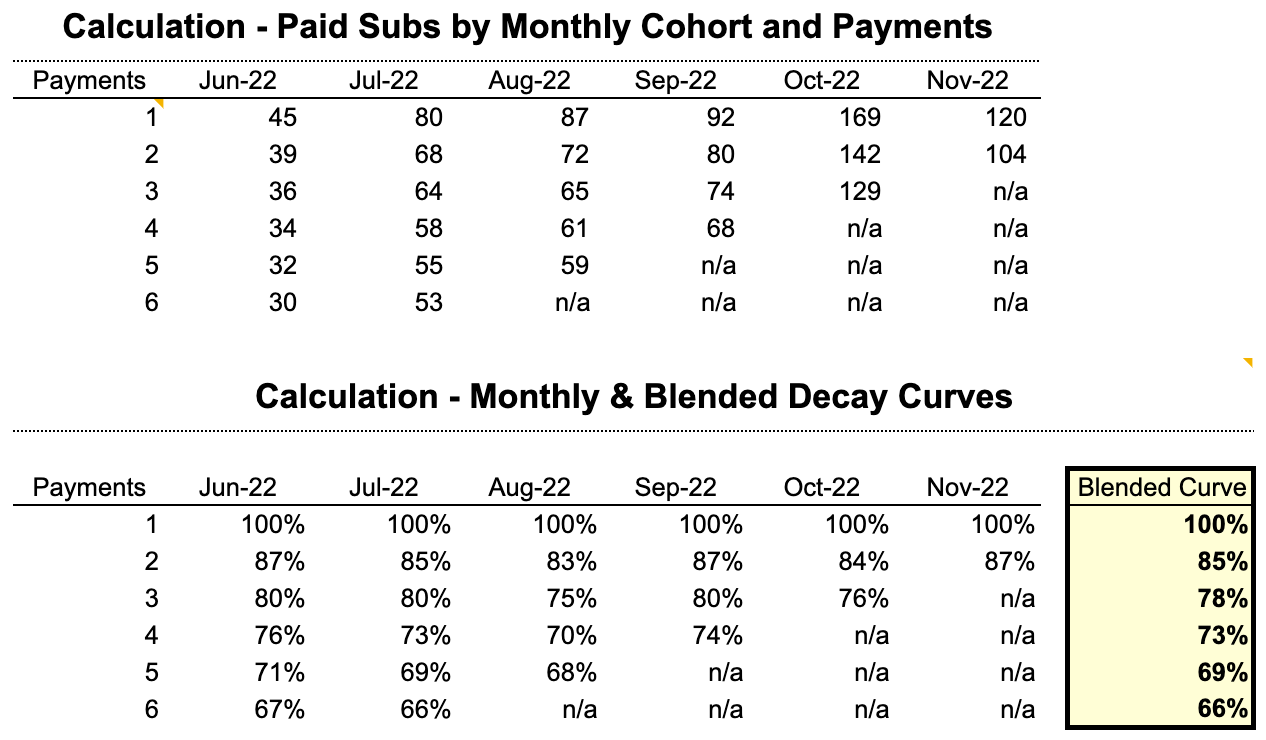
We should be more confident where we have more data and vice versa. Across all cohorts (June '22 to November '22), Big Dean has had 593 paid subs that could have paid at least two times, of which 505 have done so successfully (or 85%). But we've only had 125 paid subs that could have paid more than 6 times (e.g., June & July cohorts), of which 83 paid subs remain (or 66%). We should feel more confident in the month-2 retention rate (85%) compared to the month-6 retention rate (66%).3
How do we update our CLV model with data?
Big Dean is stoked to have actual retention data and feels empowered as he returns to the CLV model. To start, he copies over his blended decay curve to override his initial assumptions. Right away, Big Dean notices his actual retention rates are better than his initial assumptions for the decay curve.

Just by plugging in his actual retention rates, his customer lifetime nudges up to 13.3 months (vs. 13.0 months with his initial decay assumption).

But Big Dean realizes the curve looks a little funky and the power curve has also lost some of its predictive power (measured by R²). Like a guitarist tuning their instrument, Big Dean starts to adjust the exponent in the power function, taking the following steps4:
Create a line chart with our blended decay curve.

Right-click on the line and add a trendline.

Choose the power function and forecast forward 18 months (to map to our 24-month max lifetime). Select to show the equation and R-squared on the chart.

Input the new power function from the trendline into the power function driver. Fine-tune the power function, keeping an eye on the R² and shape of the curve.

Rejoice! We now have a data-driven CLV model. It’s worth noting how our customer lifetime values moved as we updated the retention data:
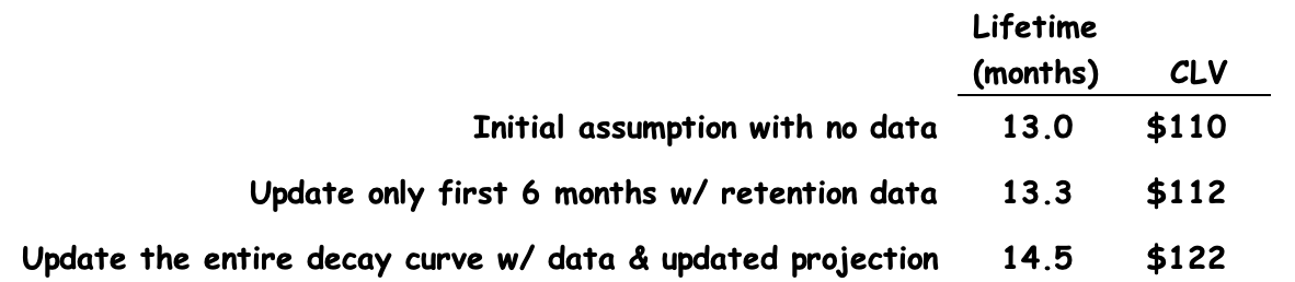
Sometimes we’ll refer to improving retention as “elevating the decay curve”. The above is a great example of how pushing up the entire decay curve can have a profound impact on your earnings.
We can rinse and repeat the steps above as we receive more data. Over time, our confidence in the model's output will strengthen as it becomes more data-driven.
What’s most important is that we now have the tools to track retention. If we see retention rates improving over time (i.e., we’re elevating the decay curve), it can indicate that our product is getting better, we’re finding our audience, or a mixture of both (i.e., we’re better connecting our audience with the value of our product).
That's all we got for now — I'd love to hear from you. How was this post helpful? What questions remain? How do you envision using what we've covered so far?
Thanks for reading,
Reid
It’s almost always more informative to look at paid retention for monthly subscriptions separate from annual subscriptions.
It’s possible to look at paid retention data on a subscription level or a subscriber level. Both approaches can be useful. At a subscription level, we want to predict how long someone will continue to pay as part of an uninterrupted subscription. At a subscriber level, we want to predict how many times someone will pay, even if it's across multiple subscriptions (e.g., they cancel and re-subscribe). Both approaches are useful — a topic for a future post.
To look at retention data on a subscription level, we anchor our retention data on the ‘Subscription’ (column Y in the ‘Stripe Invoice Data (Sample)’ tab). For retention on a subscriber level, we anchor on the ‘Customer’ (column H in the ‘Stripe Invoice Data (Sample)’ tab). For now, we're looking at retention rates on a subscription level.
Over a longer period of time, some of our retention data will become stale. Eventually, we may decide to limit the data we use for our projections. For example, for any particular point on the decay curve, we may only look at the most recent 24 months of retention data.
I’ve switched over to Excel for this part as Google Sheets doesn’t have quite as much functionality around adding trendlines. That said, it’s possible to do all these steps in Sheets. To add a trendline, double-click on the line, scroll to the bottom of the ‘Series’ section, click ‘Trendline’, and choose ‘Power Series’.
It’s also possible to avoid adding a trendline and simply adjust the exponent in the power function until the decay curve takes on a more reasonable shape.
Thanks for the great post!
The calculation formula for the Blended curve for month X is (Total retained in month X across 6 cohorts) / (Total customers acquired in 6 cohorts). Is this correct? Could you please explain a little on the usage of SUMPRODUCT in your excel?
Another helpful post - thanks Reid